The CSS3 Flexbox Grid system is based on the idea of a parent/child container relationship. The parent, if we call it “row” needs to have “display: flex;”. For example:
/* Parent */
.row { display: flex; }
The child, if we give it a class name of “col”, should have “flex: 1;”. The 1 here means 100% width of the container. For example:
/* Child */
.col { flex: 1; }
Once those values are set in the CSS, we can set the following in the HTML:
<div class="row">
  <div class="col">col</div>
</div>
This will produce one column that spans the entire width of the row container. All we need to do to get more columns is add more cols tags. For example:
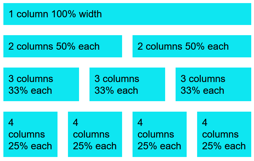
<div class="row">
  <div class="col">1 column 100% width</div>
</div>

<div class="row">
  <div class="col">2 columns 50% each</div>
  <div class="col">2 columns 50% each</div>
</div>

<div class="row">
  <div class="col">3 columns 33% each</div>
  <div class="col">3 columns 33% each</div>
  <div class="col">3 columns 33% each</div>
</div>

<div class="row">
  <div class="col">4 columns 25% each</div>
  <div class="col">4 columns 25% each</div>
  <div class="col">4 columns 25% each</div>
  <div class="col">4 columns 25% each</div>
</div>
The results can be seen in this codepen:
See the Pen Flexbox 1 by Chris Nielsen (@Chris_Nielsen) on CodePen.
Note:
If you expand or contract the width of the html browser window, you will see that each column expands or contracts responsively.
Now where Flexbox really shines is how it easily allows you to take care of mobile screens. This can be accomplished by using @media queries. For example, we can have small screens that are only 768 pixels wide show our content in a stacked row fashion instead of the complex layout we designed for a larger screen. Here is what the @media rule would look like:
/* iPad screen size */
@media screen and (min-width: 768px){
  .row {
	display: flex;
	flex-direction: row;
  }
}
Then in our CSS .row definition, add “flex-direction: column;”:
/* Parent */
.row { display: flex; flex-direction: column; }
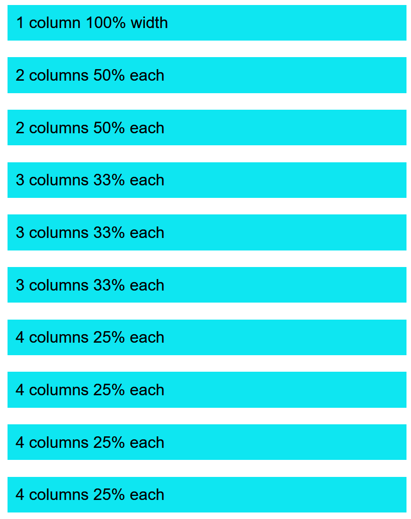
Here is an example of what it looks like if we use a min-width of 500px and our screen is resized to less than 500 pixels:
And here is what that same Flexbox grid looks like when it is 501 pixels wide:
For more information about Flexbox, see:
https://www.w3schools.com/css/css3_flexbox.asp