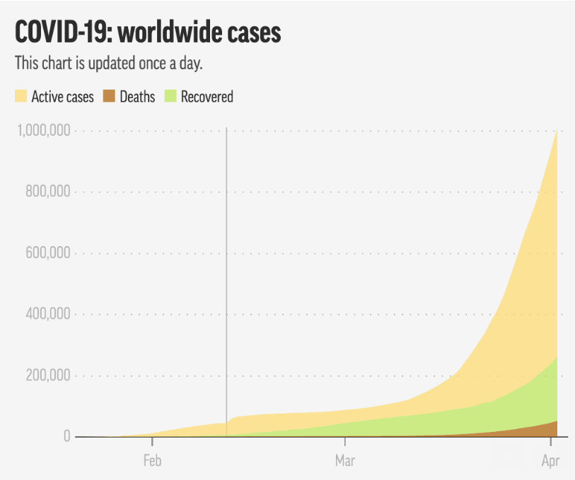
One good way to get familiar with how to use a BI (business intelligence) tool such as Tableau is to start with a simple example of a data graphic and then attempt to replicate that graphic using Tableau. In this article I will describe step by step how to create the data display below in Tableau.
I found this graphic on the internet and thought it would make a good graphic to attempt in Tableau.
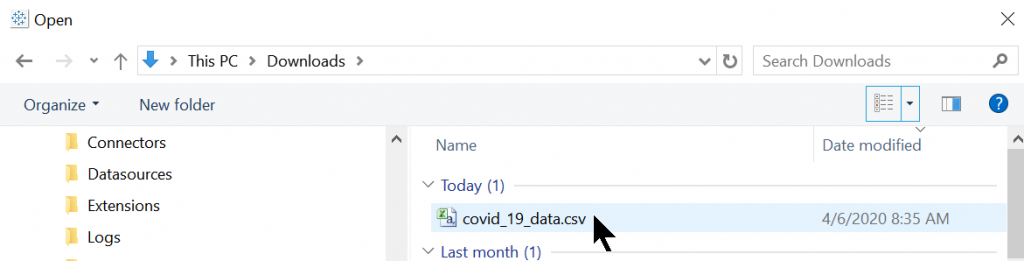
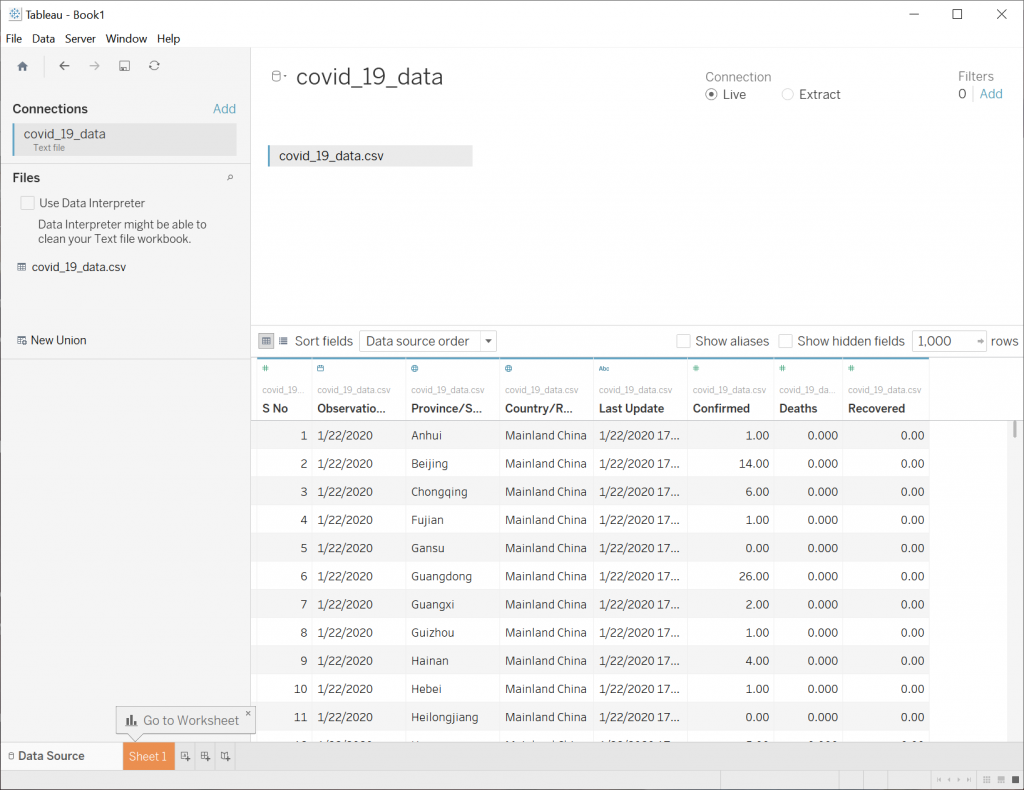
The first thing that is required is a data set that contains Active cases, Deaths, and Recovered. This was found on the internet in .csv format. For example: (11k lines long)
SNo,ObservationDate,Province/State,Country/Region,Last Update,Confirmed,Deaths,Recovered
1,01/22/2020,Anhui,Mainland China,1/22/2020 17:00,1.0,0.0,0.0
2,01/22/2020,Beijing,Mainland China,1/22/2020 17:00,14.0,0.0,0.0
3,01/22/2020,Chongqing,Mainland China,1/22/2020 17:00,6.0,0.0,0.0
4,01/22/2020,Fujian,Mainland China,1/22/2020 17:00,1.0,0.0,0.0
5,01/22/2020,Gansu,Mainland China,1/22/2020 17:00,0.0,0.0,0.0
6,01/22/2020,Guangdong,Mainland China,1/22/2020 17:00,26.0,0.0,0.0
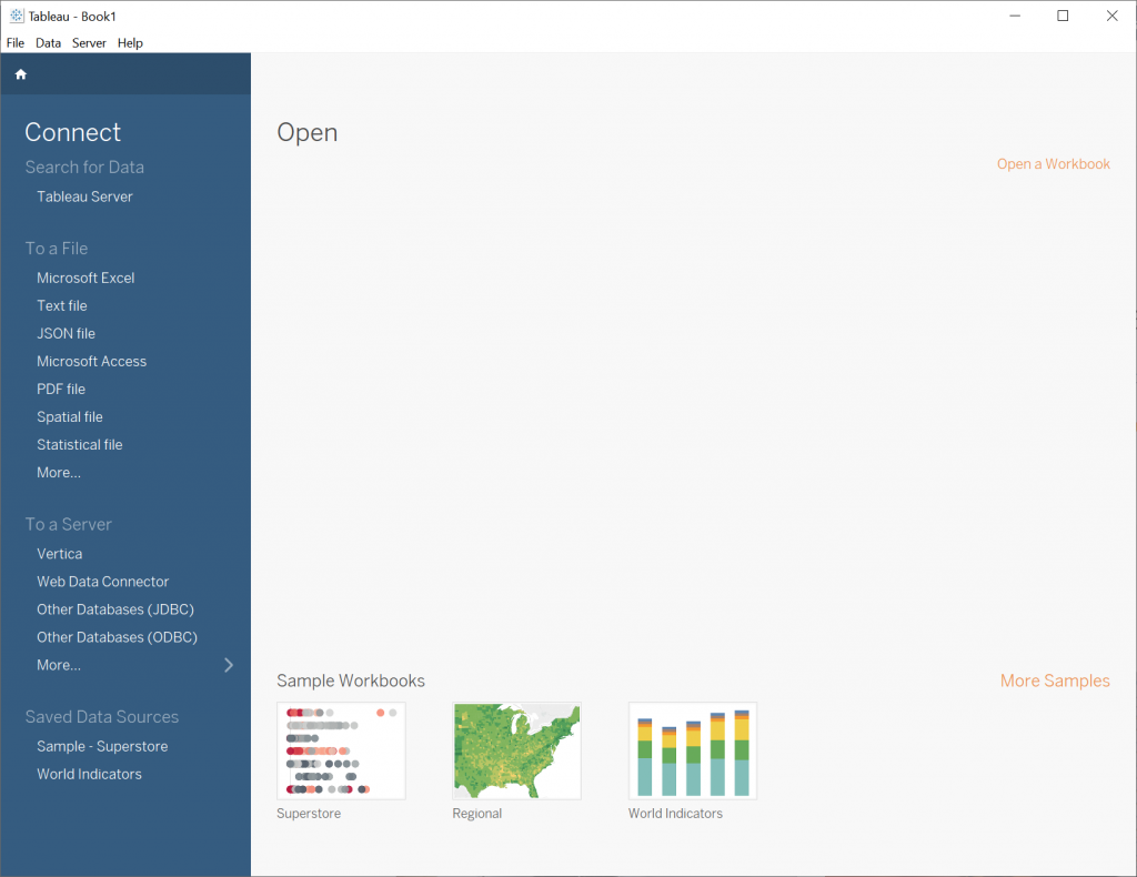
When you first open Tableau, you will see a dialog that looks like this, where you can select your csv data:
In the blue pane on the left, under Connect -> To a File -> click More… Then you can import the csv. For example:
Then you will see the data loaded in the Data Source tab in Tableau like so:
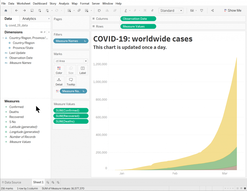
Next, switch over to the Sheet 1 tab and drag the Observation Date Dimension to the Columns list at the top. For example:
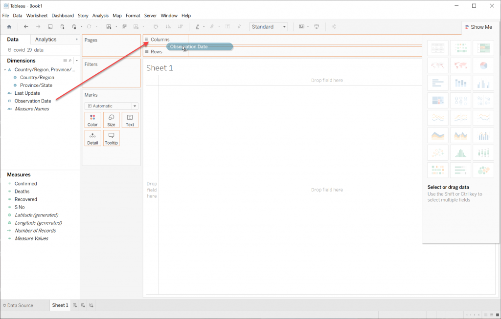
Note: The Columns and Rows fields can be thought of as the X and Y axis of the graph we are building.
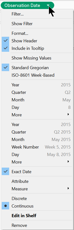
Next click on the Observation Date drop down arrow and select “Exact Date” from the menu. This should also automatically change the selection to “Continuous” from “Discrete”. This is going to provide the X-axis shape of the graph.
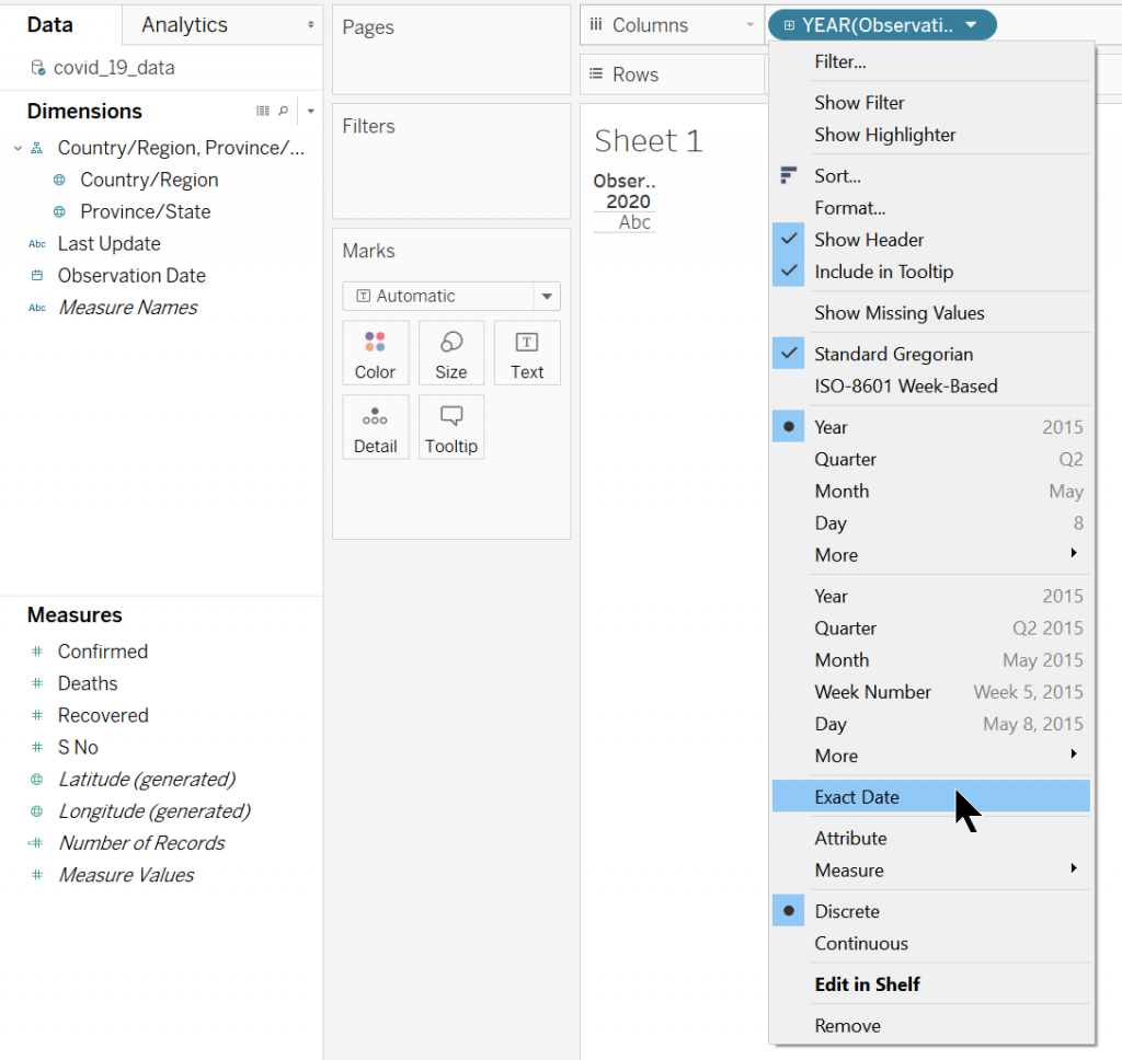
Here is what it will look like:
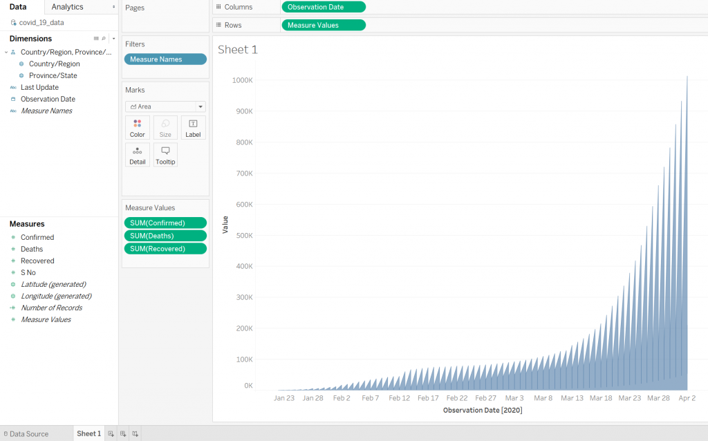
Next, move “Measure Values” from under Measures, to the Rows at the top. For example:
When moving Measure Values to Rows, Tableau will automatically generate some kind of graph in the main graph area (blue jagged lines). This will also automatically place Measure Names in the Filters box.
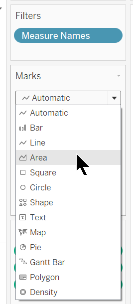
Now, under Marks below Filters, change the setting from Automatic to Area. For example:
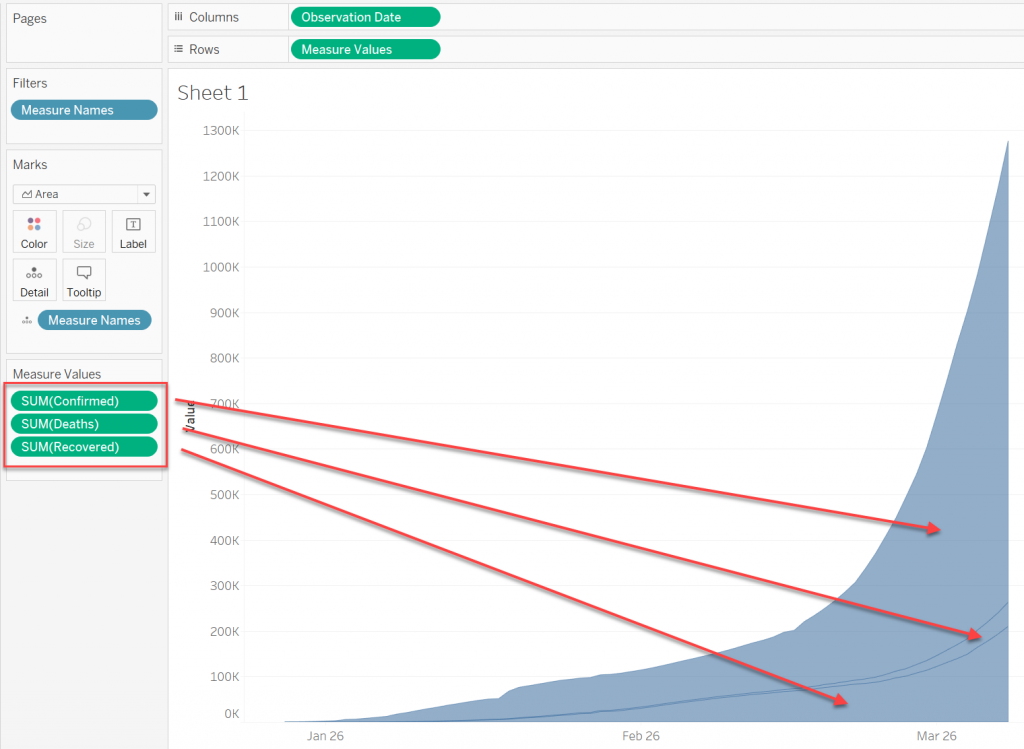
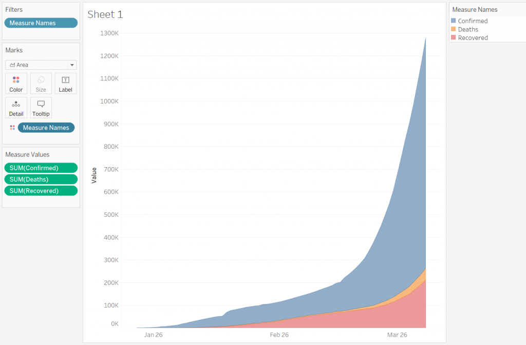
Now the graph should look like this:
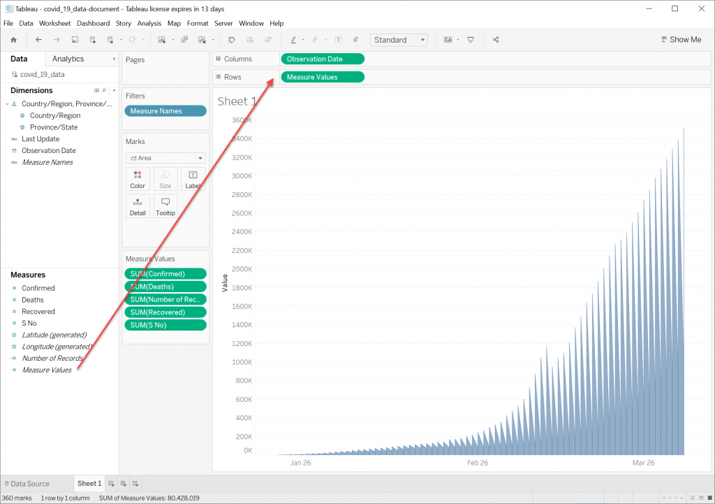
Next, drag Measure Names into the bottom of the Marks dialog.
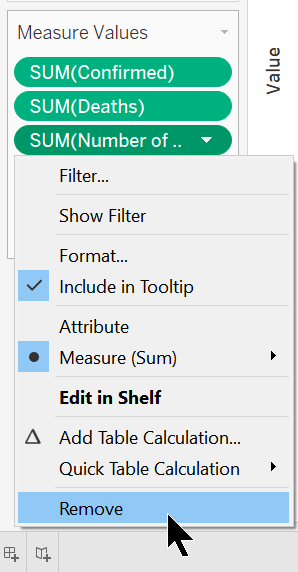
Next we need to get rid of the Measure Values we don’t need.
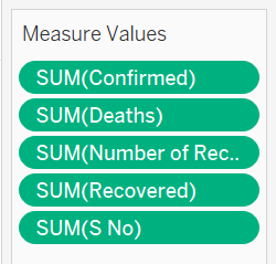
All we need is Confirmed, Deaths, and Recovered. We can get rid of the ones we don’t need by right clicking the green buttons and selecting Remove.
Once that is done, we are left with the three values we want for our graph. For example:
Next, let’s change the colors so they match the graphic we are trying to emulate. Active cases (Confirmed) should be yellow, deaths should be brown, and recovered should be green. Click on the little symbol next to Measure Names in the Marks box and change it to Color.
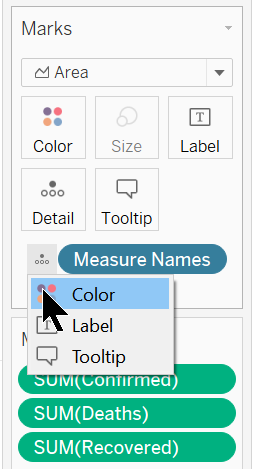
Tableau will apply some default colors to the graph. For example:
To change colors, double click on the Measure Names in the upper right box and a dialog will appear. For example:
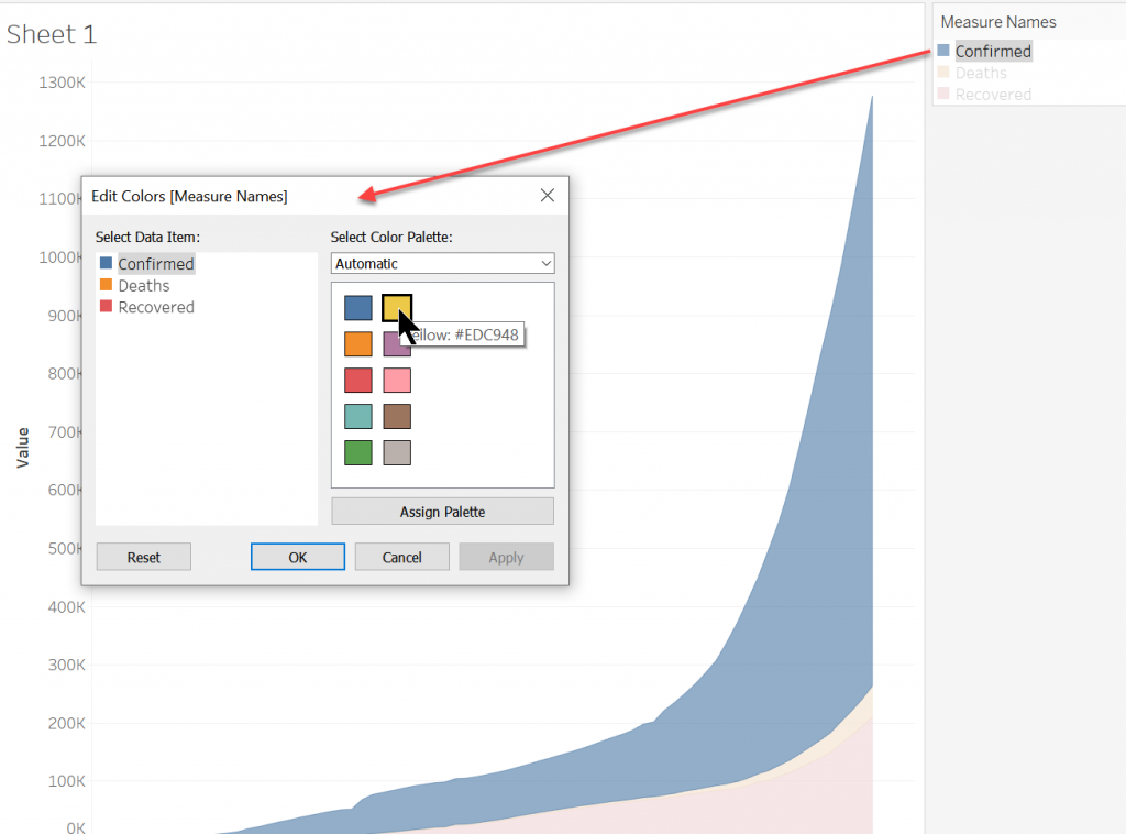
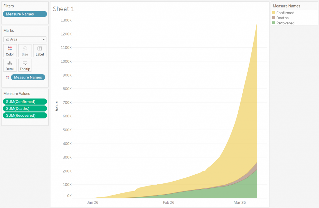
Select the desired color and click OK. Do this for each of the three. It should now look like this:
Once done editing colors, you can select Hide Card to remove the little box at the upper right hand corner.
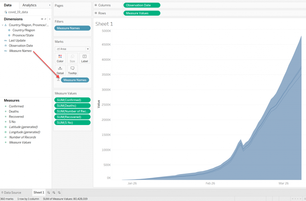
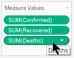
Notice that the Deaths and Recovered areas are out of order. We want Deaths on the bottom, so we will need to reorder these in the graph.
This can be done by simply grabbing the SUM(Deaths) green button under Measure Values and dragging it to the bottom to reorder them.
Which yields:

All that is left is to change the title of the graph, and change the X and Y labels.
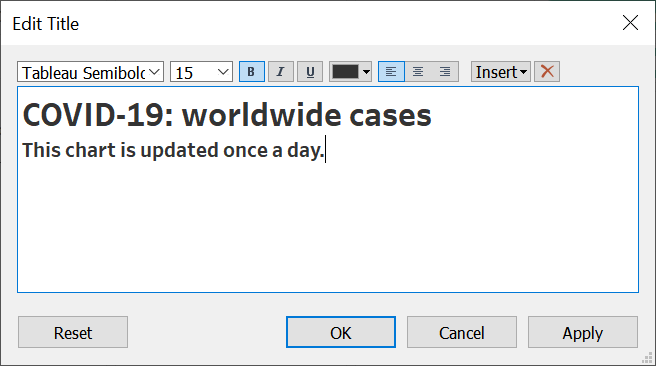
To edit the title, double click “Sheet 1” and an Edit Title dialog will pop up.
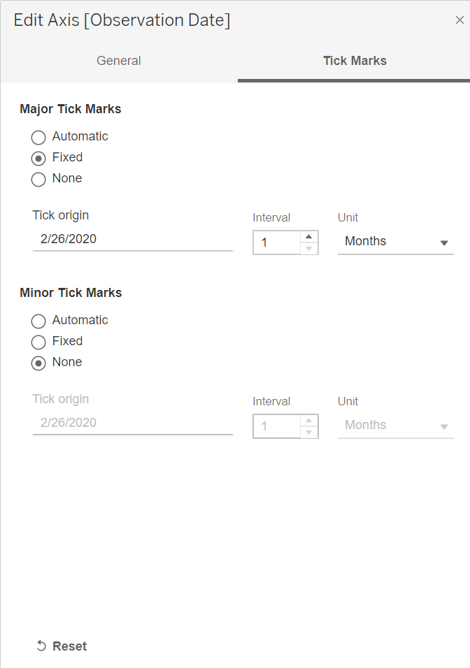
To edit the dates at the bottom so they just say “Jan”, “Feb” and “Mar”, double click the bottom axis and an “Edit Axis” dialog box will pop up.
On the Tick Marks tab, choose Fixed under Major Tick Marks and None for Minor Tick Marks. Also set the Unit to Months, as shown here:
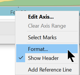
Then right click on one of the dates, such as “Feb 26” and select Format.
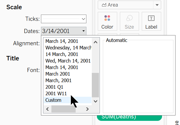
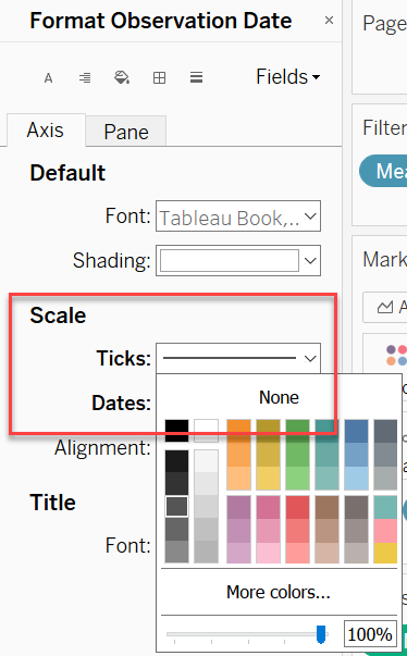
Then on the left there will be a “Format Observation Date” pane. In the Axis tab, click the Dates drop down under Scale.
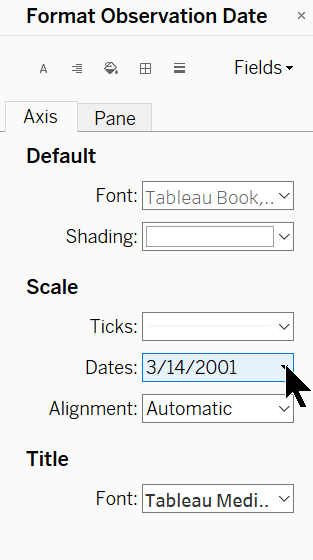
This will allow you to set the date format. In this menu, click “Custom”:
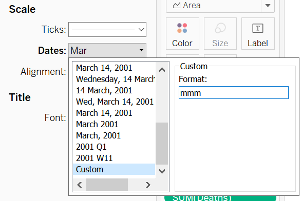
After clicking “Custom”, type ‘mmm’ in the input box. This will change the date to “Mar”.
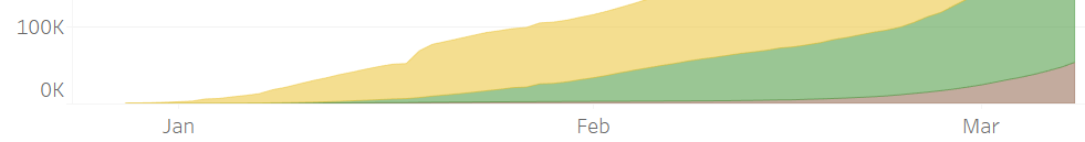
Now the labels in the X axis look like this:
The tick marks themselves can be made more visible by editing the color in the Format Observation Date pane.
The final step is to change the labels on the Y axis. This can be done the same way edits were made to the X axis labels.
This time instead of editing a Date format, we are editing the Numbers type. Choose “Number (Standard)”.
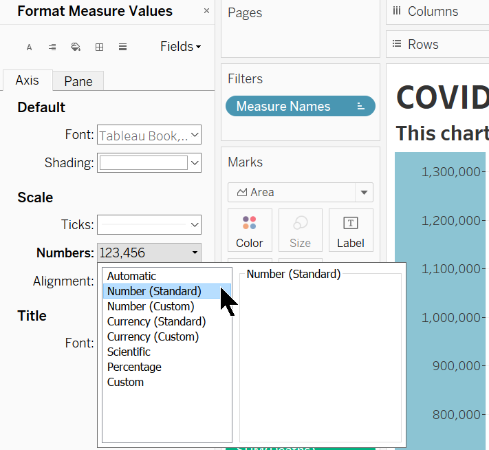
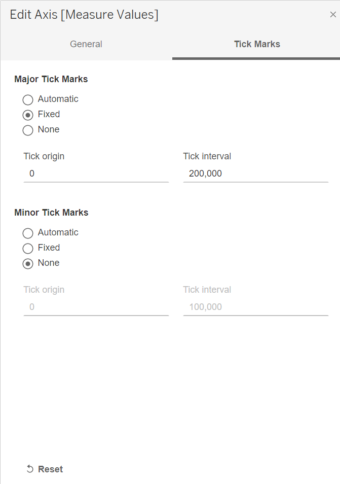
All we have left now is to get rid of the Y axis label and change the increments to 200,000. Do these by double clicking the Y axis.
That’s it! The data has been successfully displayed in Tableau!