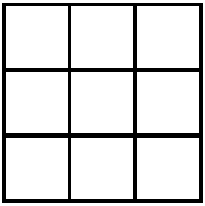
In order to create a game of tic-tac-toe using React.js, I first needed to figure out how to create a 3×3 grid of squares using HTML and CSS. Turns out, with CSS grid it is fairly straightforward.
All we need is three CSS classes:
- container: This is the highest level div that will contain the grid. It needs to have a background color that will be used as the border color between cells.
- grid: This is where the grid magic happens. grid-gap is used to “reveal” the background color and therefore create the cell borders.
- cell: The cell class defines the size and placement of the font.
Here is what the HTML looks like:
<div class="container">
  <div class="grid">
    <div class="cell" id="1">1</div>
    <div class="cell" id="2">2</div>
    <div class="cell" id="3">3</div>
    <div class="cell" id="4">4</div>
    <div class="cell" id="5">5</div>
    <div class="cell" id="6">6</div>
    <div class="cell" id="7">7</div>
    <div class="cell" id="8">8</div>
    <div class="cell" id="9">9</div>
  </div>
</div>
Here is the CSS:
.container {
  background: black;
  display: inline-block;
  border: 5px solid black;
}

.grid {
  display: grid;
  grid-template-columns: repeat(3, 80px);
  grid-template-rows: repeat(3, 80px);
  grid-gap: 5px;
}

.cell {
   /* center the cell content */
  justify-content: center;
  align-items: center;
  display: flex;
  font-family: Arial;
  font-size: 3rem;
  font-weight: bold;
  background: white;
}
Important CSS details that make this work:
display: inline-block;in the container class.display: grid;in the grid class.grid-template-columns: repeat(3, 80px);in the grid class sets up the columns.grid-template-rows: repeat(3, 80px);in the grid class sets up the rows.grid-gap: 5px;in the grid class sets up gaps (borders) between the cells.display: flex;in the cell class.
If any one of the above details are missing, then the grid won’t work.
Here is what the grid looks like on Codepen:
See the Pen CSS 3×3 square grid flexbox solution by Chris Nielsen (@Chris_Nielsen) on CodePen.