Building on the Flexbox foundation described in this previous article:
HTML & CSS: How to understand the basics of Flexbox for responsive web design
I am now going to describe how to control columns that may have varying amounts of data in them. Flexbox has an attribute for the child element called “align-self” which can be set with the following settings:
align-self: auto;
align-self: baseline;
align-self: center;
align-self: flex-end;
align-self: flex-start;
align-self: stretch;
Here is an example of usage, set in the Flexbox child element:
/* Child */
.col {
  flex: 1;
  align-self: flex-start;
  background-color: #fff;
  margin: 10px;
  padding: 10px;
}
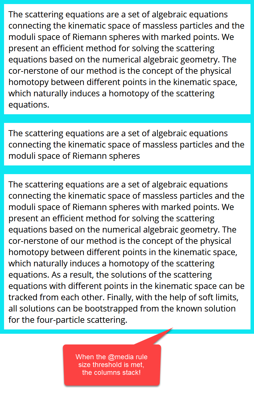
Note:
With the same media settings that were used in the previous article referred to above, when the browser window is shrunk, the columns are all automatically stacked.
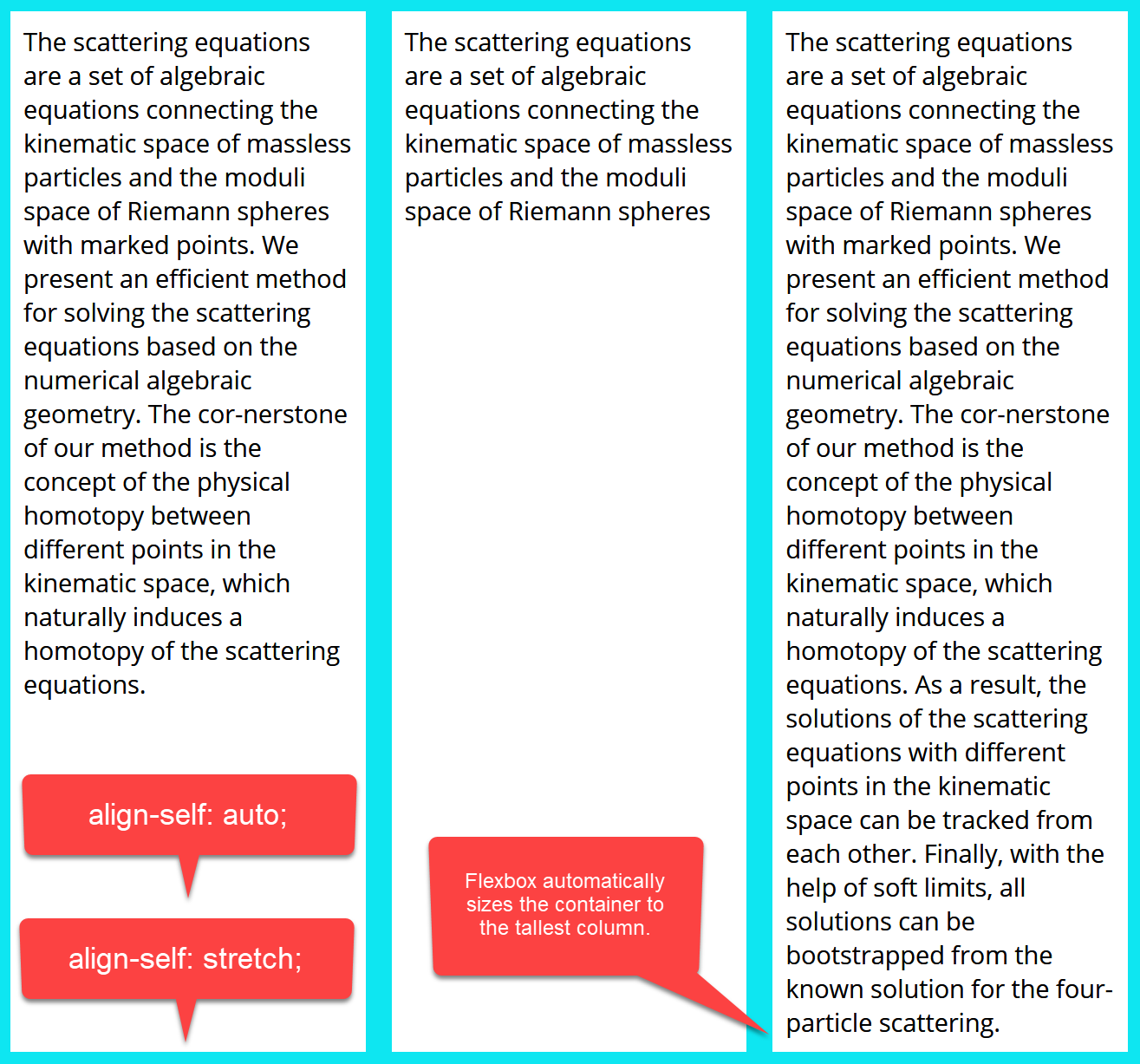
The following two settings produce the same result. All child cols in the parent row are expanded to the maximum height of the tallest row:
align-self: auto;
align-self: stretch;
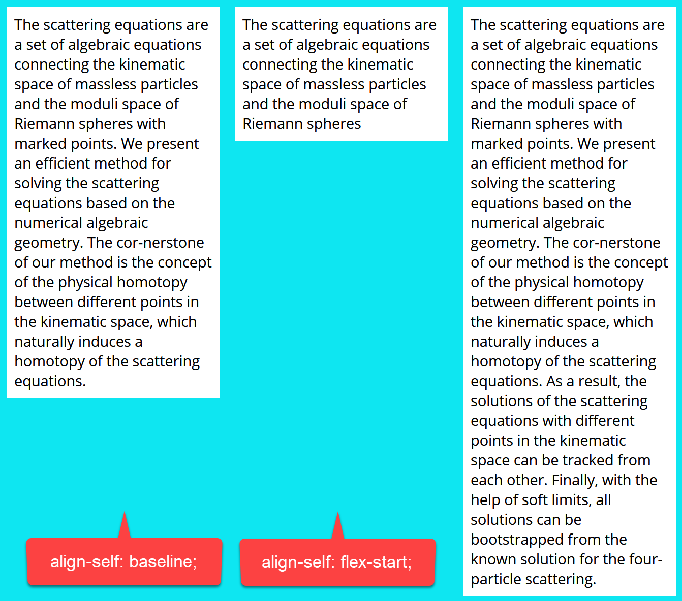
These two settings produce the same result where the columns have different heights, each column fits its content and they are all aligned at the top of the container.
align-self: baseline;
align-self: flex-start;
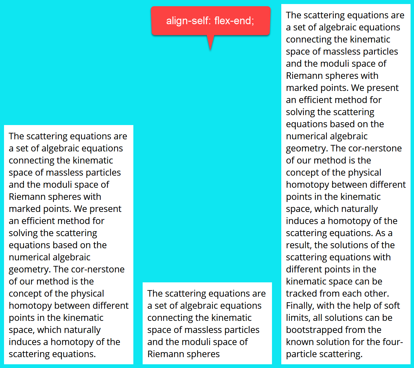
The final two options look like this:
align-self: center;
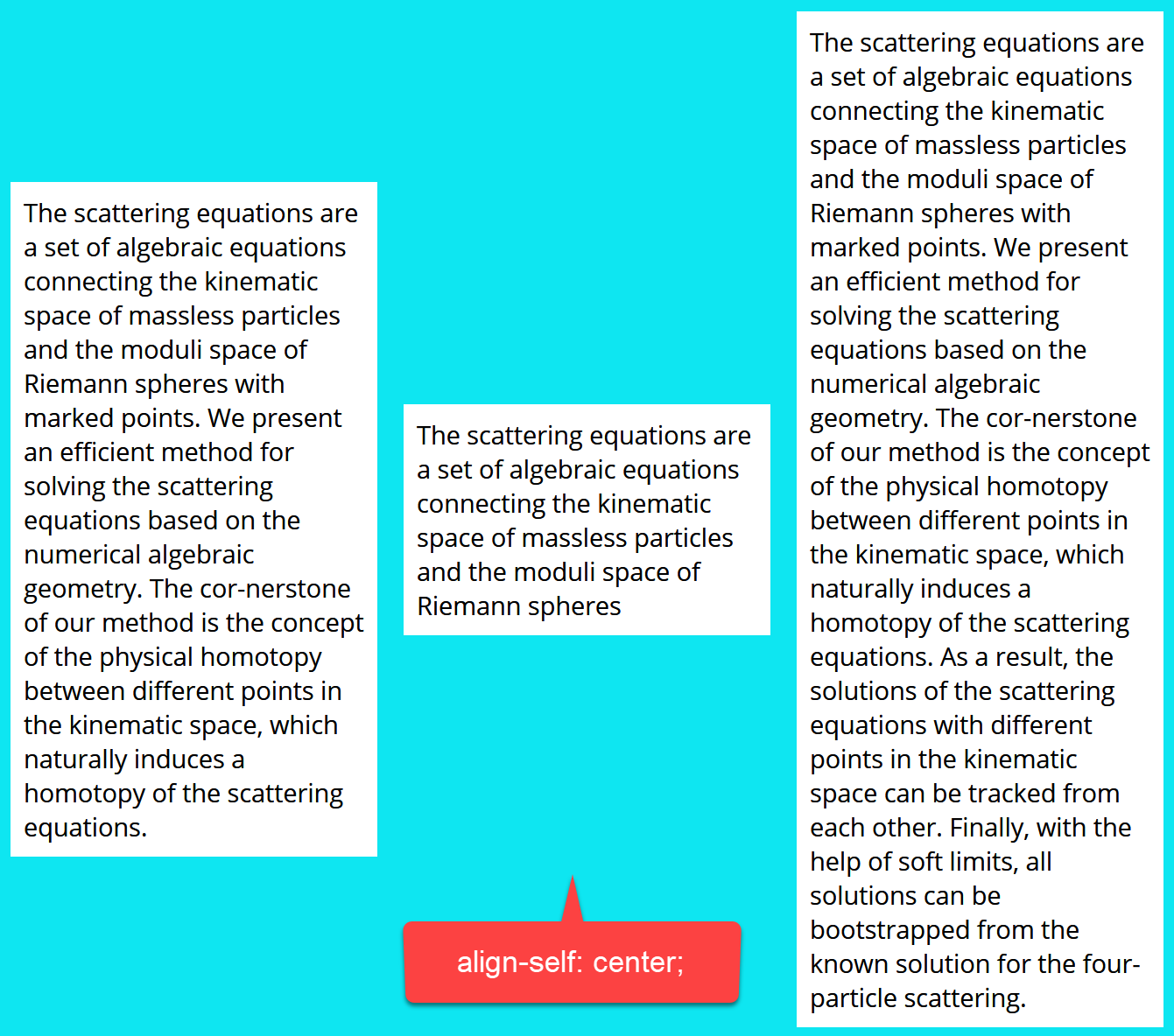
align-self: flex-end;
For more information about the Flexbox align-self property, see:
https://www.w3schools.com/cssref/css3_pr_align-self.asp